
- About us
- Services
- E-Commerce Development
- White Label Marketing
- Digital Marketing
- Mobile App Development
- Other Services
-


Building a website that actually gets people to do what you want them to do – buy something, sign up, whatever – can feel like a puzzle. It’s not just about looking pretty, though that helps. There are certain ways to put things together, certain web design principles, that make a big difference. Think of it like building a really good store. You want it to look nice, sure, but more importantly, you want people to find what they need easily and feel good about buying from you. This web design principles checklist is here to help you do just that.
First impressions matter, and on the web, that means looking the part right from the start. If your site looks like it was built in 2005, people might assume your business is just as outdated. We need to make sure visitors feel confident they’re in the right place, dealing with professionals who know their stuff.
Your website needs to look good and work well no matter what device someone is using. A site that’s clunky on a phone or requires a ton of zooming and scrolling just won’t cut it. This isn’t just about looks; it’s about making it easy for people to find what they need. Think about it: if your site is hard to use on a mobile, a potential customer might just give up and go to a competitor. We want to avoid that.
Don’t just say you’re good at what you do; show it. This means having content that clearly explains your knowledge and experience. Think about including things like:
The goal here is to make visitors think, “Wow, these people really know what they’re talking about.” Every piece of content should reinforce that idea, making it clear you’re the right choice.
Clarity is king when it comes to building trust. Vague language or confusing statements can make people hesitant. We need to be direct and honest about what you do and what clients can expect. This involves:
When your message is clear and your expertise is evident, people feel more comfortable moving forward.
Making your website easy to use is a big deal. If people can’t figure out where to go or what to do, they’ll just leave. It’s like walking into a store with no signs – super frustrating. We want visitors to feel comfortable and find what they need without a second thought. This means thinking about how they move through the site from the moment they arrive.
Let’s face it, most people are on their phones these days. So, designing for mobile first isn’t just a good idea, it’s pretty much required. This approach means we build the site with the smallest screens in mind, then scale it up for tablets and desktops. It forces us to be really clear about what’s important and get rid of anything extra. This way, no matter what device someone is using, the menus are easy to tap, buttons are big enough, and everything loads quickly. It’s about making sure the experience is good for everyone, everywhere.
White space, or negative space, is that empty area around text and images. It’s not wasted space; it’s actually super important. Think of it like the margins in a book. Without them, the text would be a jumbled mess. On a website, white space helps break up content, making it easier to read and understand. It gives your eyes a place to rest and helps guide the visitor’s attention to the important stuff. Too much text crammed together? People will just scroll past. Giving content room to breathe makes it feel less overwhelming and more professional. It’s a simple trick that makes a big difference in how people interact with your pages.
Good use of white space makes content feel less dense and more approachable. It helps users focus on what matters most without feeling overwhelmed by information.
Sometimes, you have a lot of information or features to show. Instead of dumping it all on the user at once, progressive disclosure is the way to go. This means showing only the necessary information initially and then revealing more details as the user asks for them, perhaps by clicking a button or expanding a section. It keeps the initial experience clean and simple. For example, instead of showing every single product feature upfront, you might show the main benefits and then have a “See all features” link. This approach is great for complex topics or long forms, preventing users from getting lost or bored. It’s about giving users control and presenting information in manageable chunks. This method is a key part of good web design principles.
Here’s a quick look at how it works:
Your website’s main job is to get people to take a specific action, right? Whether that’s buying something, signing up for a newsletter, or requesting a quote, you need to make it super clear and easy for them. It’s not about tricking anyone; it’s about showing them the best way to solve their problem using what you offer.
People don’t usually go online looking for a “widget provider.” They’re looking for a solution to a problem they have. So, instead of shouting about your services from the rooftop, talk about the pain points your visitors are experiencing. Frame your content around their challenges and then introduce your service as the answer. This approach makes your message way more relevant and engaging.
Think about it: if someone is struggling with a messy budget, they’re more likely to click on something that says “Tame Your Finances” than “Budgeting Services Available.” It speaks directly to their current situation.
Every page on your website should have a single, primary goal. Trying to get visitors to do too many things at once is like giving them a map with a dozen destinations marked – they’ll just get confused and probably won’t go anywhere. Decide what the most important action is for that specific page and make it the star of the show.
This doesn’t mean you can’t have secondary actions, like a link to your blog or social media. But they should be de-emphasized. The main call to action needs to be obvious, standing out visually and in terms of messaging. It should be the easiest, most logical next step for the visitor.
Here’s a simple way to think about visual hierarchy on a page:
Your calls to action (CTAs) are the signposts that guide visitors. They need to be clear, compelling, and action-oriented. Generic phrases like “Click Here” just don’t cut it anymore. Use language that tells people exactly what they’ll get or what will happen next.
Consider using phrases that create a sense of benefit or urgency, like “Get Your Free Guide Now” or “Start Saving Today.” The color and placement of your CTA buttons also matter a lot. They should stand out from the rest of the page without looking out of place. A well-designed CTA can make a huge difference in getting someone to take that next step.
The goal is to make the desired action feel like the most natural and beneficial choice for the visitor, removing any guesswork or hesitation they might have.
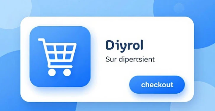
Nobody likes a complicated checkout. If it feels like a chore, people will just leave their carts full. We need to make this part as easy as possible.
Think of your checkout like a path. If there are too many bumps, people will turn around. We want to clear that path so they can get to the finish line without any hassle. This means cutting out unnecessary steps and making sure every field is easy to understand and fill out. A smooth checkout is key to getting more sales.
The easier you make it for someone to pay you, the more likely they are to actually do it. It sounds simple, but so many sites overcomplicate this.
Not everyone wants to create an account. Forcing them to sign up before they can buy something is a big turn-off. Offering a guest checkout option means they can buy what they want quickly and move on. You can always ask them to create an account after the purchase is complete if you want.
People need to feel safe when they enter their payment details. Using well-known and trusted payment gateways like Stripe or PayPal shows customers that you take their security seriously. Make sure you display any security badges or SSL certificates clearly so they know their information is protected. This builds confidence and makes them more comfortable completing the transaction.
Nobody wants to buy from a website that feels sketchy. Every bit of your site, from how it looks to how it works, needs to tell visitors, “Hey, you can trust us here.” It’s about making people feel comfortable and confident.
Your website is often the very first thing someone sees of your business. If it looks dated, with clunky graphics or low-quality images, people might just click away. A clean, up-to-date look signals that you pay attention to detail and that your business is current. It’s like walking into a well-kept shop versus one that looks like it’s falling apart – you’re more likely to stick around in the first one.
When it comes to transactions, people get nervous about their information. You need to show them you’re serious about security. This means having things like SSL certificates visible, maybe logos of trusted payment providers you use (like Visa, Mastercard, or PayPal), and clearly stating how you protect customer data. Little badges and clear statements can make a big difference in stopping someone from abandoning their cart at the last second.
Think about how many people browse on their phones. If your site looks great on a desktop but is a mess on a smartphone, you’re losing a huge chunk of potential customers. Everything needs to work smoothly, buttons should be easy to tap, and text should be readable without zooming in. A site that’s difficult to use on mobile feels unprofessional and can make people doubt your business.
Making your website easy to use and look good on any device isn’t just about aesthetics; it’s about respecting your visitor’s time and making it simple for them to do business with you. When things just work, people feel more secure and are more likely to complete their goals on your site.
Nobody likes waiting around for a website to load. If your pages take too long to show up, people will just leave. It’s that simple. Slow websites hurt your chances of getting customers and can even make search engines rank you lower.
Images are often the biggest culprits when it comes to slow load times. You need to make sure they’re as small as possible without looking terrible. Using newer file types like WebP can help a lot because they offer better compression. Think about it: if you can get a good-looking image that’s half the file size, that’s a win.
Just like images, the code that makes your website work – JavaScript and CSS – can also slow things down. When these files are too big or there are too many of them, the browser has to do a lot of work to put everything together. Minifying these files means removing unnecessary characters and spaces. It’s like cleaning up your code so the browser can read it faster.
Lazy loading is a smart technique where images and other content that aren’t immediately visible on the screen don’t load until the user scrolls down to them. This means the initial page load is much quicker because the browser isn’t trying to load everything at once. It’s especially useful for pages with lots of images or long articles.
Speed isn’t just a technical detail; it’s a direct signal to your visitors that you respect their time. A fast website feels professional and makes it easier for people to find what they need, which ultimately leads to more conversions.
Here’s a quick look at what to aim for:
People don’t just want to buy something; they want to solve a problem. If you can show them you understand their issues and offer real help before asking for anything, they’re way more likely to trust you. This is where giving away good stuff upfront really pays off.
Forget those flimsy “5 Tips” PDFs that just gather digital dust. Think about what your potential clients are actually struggling with. Create resources that solve those specific pain points. For example, a financial advisor could make a calculator that helps people figure out their retirement readiness. One firm did this and got hundreds of good leads every month. Or maybe templates for planning projects or spreadsheets for budgets? Make them easy to use right away, not just theory. Adding instructions or even short videos makes them even better.
Here are some ideas for resources that work:
The key is to make these resources so useful that someone would normally pay for them. When you give them away freely, you build a sense of obligation and show you’re an expert who genuinely wants to help.
Webinars are a fantastic way to connect with a larger audience in real-time. You can discuss a specific topic, answer questions, and show your personality. Think about hosting a live session on a common problem your clients face, like “Streamlining Your Supply Chain in 5 Steps” or “Understanding the Latest Tax Changes for Small Businesses.” After the webinar, you can offer a recording or related materials, which keeps the engagement going.
Email courses are another great method. You can break down a complex topic into bite-sized lessons delivered over several days or weeks. This keeps your brand top-of-mind and allows people to learn at their own pace. For instance, a marketing agency could offer a 7-day email course on “Boosting Your Social Media Engagement.” It’s a low-pressure way for people to get to know your approach and see the value you provide.
This is a more direct way to offer value, but it can be incredibly effective. A free strategy session, sometimes called a consultation or discovery call, lets you talk directly with a potential client about their specific challenges. During this session, you’re not just selling; you’re listening, asking questions, and offering initial insights and potential solutions. This direct interaction builds a strong personal connection and allows you to demonstrate your problem-solving abilities firsthand.
Here’s how it can work:
So, we’ve gone over a bunch of ways to make your website work better for you. It’s not just about making things look pretty; it’s about making it easy for people to find what they need and trust you enough to take the next step. Think about how users experience your site from their point of view, not just yours. Making things clear, fast, and secure really does make a difference. By focusing on these design principles, you’re not just building a website, you’re building a tool that can actually help your business grow. Start small, test things out, and keep tweaking. Your visitors will thank you for it, and your bottom line will too.
Many businesses talk too much about what they do instead of focusing on the problems their customers have. People visit websites looking for solutions to their issues, not just a list of services. It’s like going to a doctor and them just listing their medical degrees instead of asking what hurts.
Most people use their phones to browse the internet these days. If your website looks messy or is hard to use on a small screen, people will likely leave and go somewhere else. Making it look great and easy to use on phones first is super important.
Use plenty of empty space, like margins and padding, around your text and images. This makes content easier to read and digest. Also, try to have only one main goal or action for each page so visitors aren’t overwhelmed with choices.
People need to feel safe and sure that your business is real and reliable. Showing trust badges, security seals, having a professional and modern look, and making sure your site works perfectly on all devices helps build that confidence. Clear messages also help a lot.
Make it super clear what you want them to do next with strong ‘call to action’ buttons. These should stand out and tell people exactly what will happen. Also, make the process of buying or signing up as simple and quick as possible, without too many steps.
Giving away helpful resources shows that you know your stuff and are willing to help even before someone becomes a customer. It builds trust and attracts people who are genuinely interested in what you offer. This can lead to more sales down the road.
© Copyright 2026 F5 Buddy Pvt. Ltd.. All Rights Reserved
 Career
 Woo-Commerce