- About us
- Services
- E-Commerce Development
- White Label Marketing
- Digital Marketing
- Mobile App Development
- Other Services
-


Color Theory; does it make any difference in Web Design? Colors have its own significance which stems from the color importance of the human mind. Color sparks curiosity, it create ideas and generates emotions. Various colors have a universal significance for example, the color white signifies peace whereas color red a warning. Bright colors show positive moods while warm colors show inventiveness and confidence. Various organizations offering Responsive Web Design Sevices have adapted the concept of color theory for designing a website.
As every color has its own importance, it becomes difficult to choose color for your website. It is important to choose colors that add an extra strength and quality to your website and helps in its branding.
Before understanding about the color theory, one should know the following color terms :
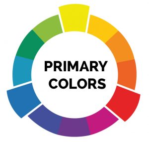
Primary colors are the foundation for all other shades. Traditionally, we perceive red, blue, and yellow as the base colors and all other colors as the combination of these three varying in amounts, brightnesses, shades and tints.
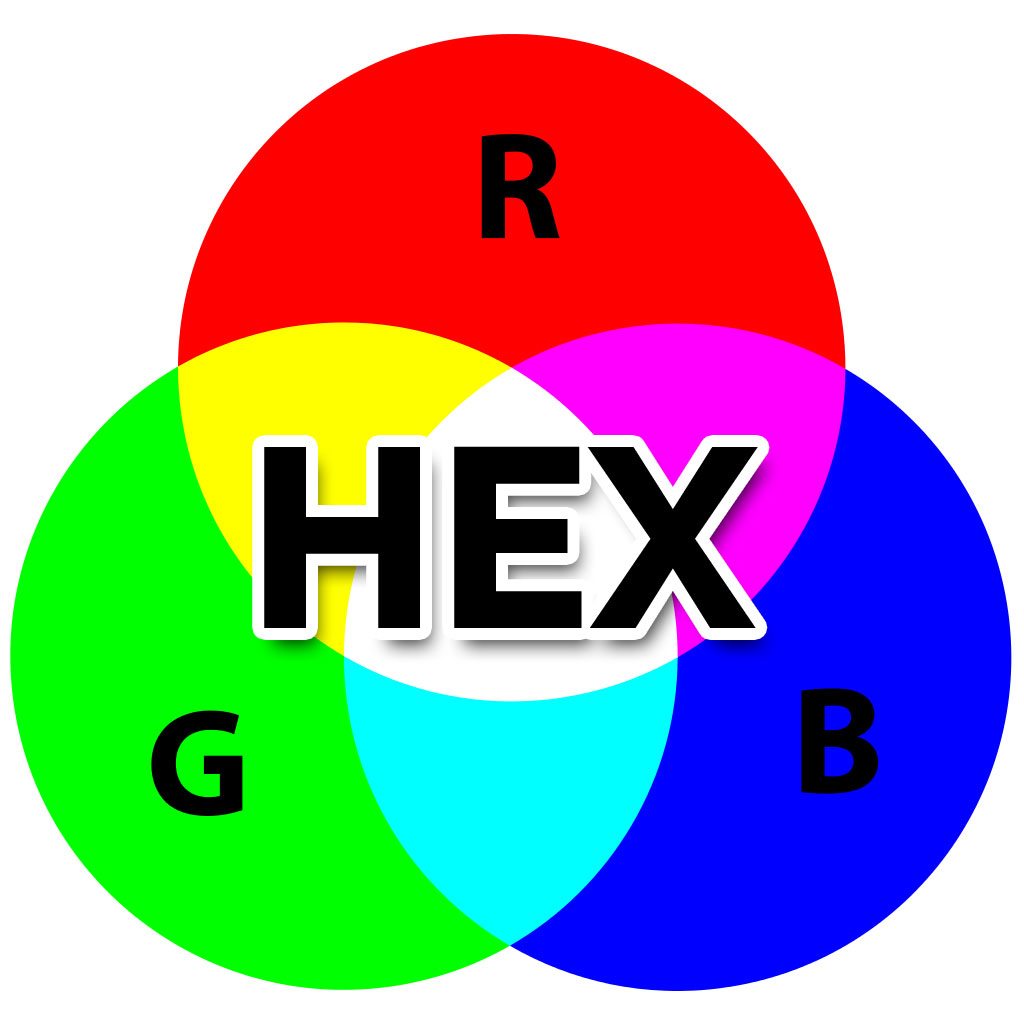
Using various shades of Red, Green and Blue ( RGB ) one can create other colors.
Combination of RGB and Hex values represents colors online. Where RGB color system classifies all colors as a combination of all three colors, Hex color system converts each value to a hexadecimal representation.
Example :-
For RGB – rgb(59, 89, 145) equals Facebook blue
For Hex- #000000 equals black
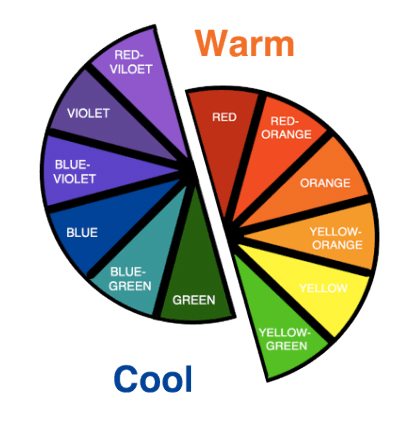
Colors are classified as warm and cool colors.
Warm colors have higher amounts of reds and yellows. They are perceived as energetic and can raise a sense of passion in a design. Warm colors generally remind us of sun or fire.
Whereas cool colors contain higher amounts of green and blue, they provide impression of calmness, and build soothing impressions. Cool colors are actualy less aggressive and much more soothing.
Increasing temperature of an image means to increase its orange levels. Raising the orange level of an image makes look it happier and warmer, like how the world looks joyful when the sun casts its orange glow upon it. On the other hand, reducing temperature of an image makes it look colder and less inviting, like an overcast day.

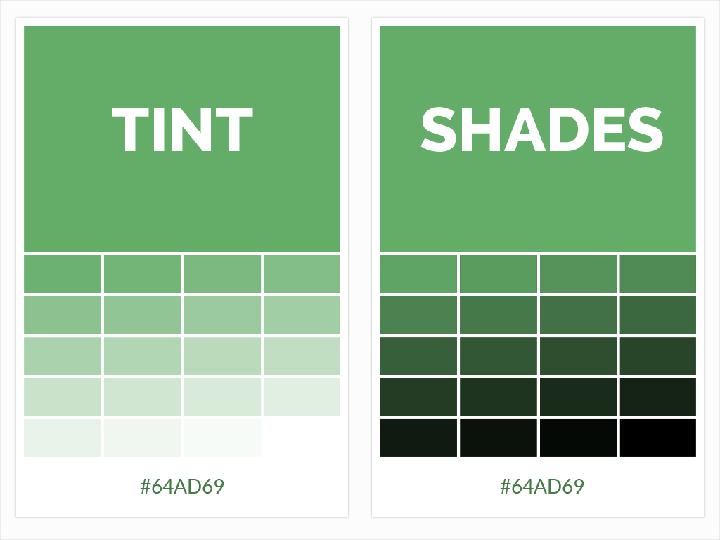
A tint is a result when you add white to a color.
A shade is a result when you add black to a color.
A tint is a result when you add gray to a color.
Saturation is known as the intensity of a color. Color becomes richer and darker when you increase saturation and when you reduce saturation it makes look images faded and lighter.
Hue is a degree to which a color can be described as similar to or different from { VIBGOR} red, orange, yellow, green, blue, indigo, and violet.
Lightness, also recognized as value or tone, describes the perceived brightness of a color compared to pure white.

A basic color wheel has the 12 standard colors that are used to create color schemes. Each segment of the pie signifies a family of colors that can be made using various saturations, hues, tints, shades, and mixes of neighboring colors. The combination colors (e.g., Blue-Green) result from mixing equal amounts of the base hues (Blue and Green)
Designs use the color wheel to select color schemes, which are of four types:-
Designers build color schemes by combining various colors from the color wheel. This works best when you use one of the following color scheme patterns.
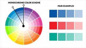
A monochrome color scheme is made up of different tints, shades, and saturations of a single base color. They’re very consistent, but contain the risk of getting monotonous.
A monochrome color scheme based on purple.
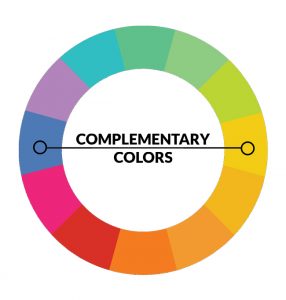
Complementary schemes are made of two colors that are opposite sides on the color wheel. As this scheme is intrinsically high-contrast, it provides noticeable impact on people.
Tip: Using complementary scheme for your calls to action is very beneficial. For an example if background of your webpage is grey, you might use the darker color like orange or green for your CTA button.
Complementary color scheme based on green and red shades
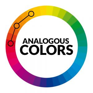
Analogous schemes use three colors that are next to each other on the color wheel. They due to the tonal similarities go together and create very cohesive, calm and comfortable designs. The first color in analogous scheme dominant, second support and third act as an accent.
Analogous color scheme based on orange, yellow and green.
Triadic scheme uses colors that are equally spaced around the color wheel. It creates a vibrant, visually contrast yet balanced look to design. For creating triadic scheme draw an equilateral triangle on the color wheel, and pick the three colors at the points of the triangle.
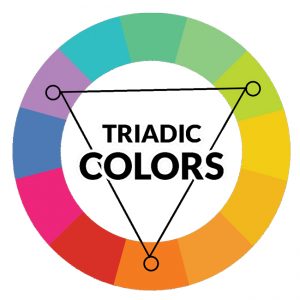
Triadic color scheme based on orange, violet, and green.
The importance of colors in website design is defined as these three parts.
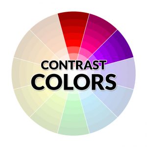
1. The Contrast
Contrast helps the images and texts to stand out from background. They help to stop the strain and gain attention of the viewers. Several successful web designs have implemented soft and well balanced contrast which makes the visible objects to pop out.
2. The Vibrancy
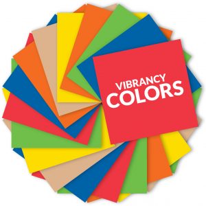
The shading that reverberates according to the site viewer gets particular states of mind and this is the thing that Vibrancy remains for. Like we defined brighter colors bring in energy and excitement, colors that are cold tend to relax viewers. In this way, such traps are to be utilized to enhance the client experience of your site.
3. The Complementation
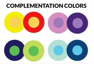
There are numerous colors that look great independently however might not blend well when combined. To make a wonderful and appealing design, appropriate color complementation must be used. Colors that are opposites are to be evaded. Color complementation either makes or breaks the visual creation of your website.
F5 Buddy provides Responsive Web Design Services keeping color theory in mind. We understand the importance of color combination for designing successful websites and to connecting your business positively with your clients. Hire Expert Web Designer from F5 Buddy to get best Responsive Web Design Services in the market.
© Copyright 2026 F5 Buddy Pvt. Ltd.. All Rights Reserved